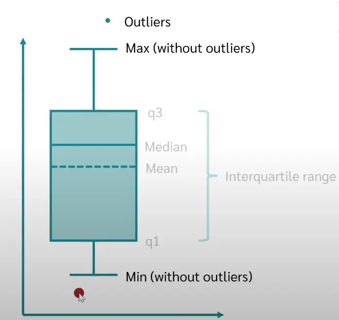
Box plots are used to graphically display various pieces of information at a glance, such as the Median, the interquartile ranger and the outliers. A box plot is usually created to compare and contrast two or more groups.
The data must have metric scale level in order to be represented in a box plot.
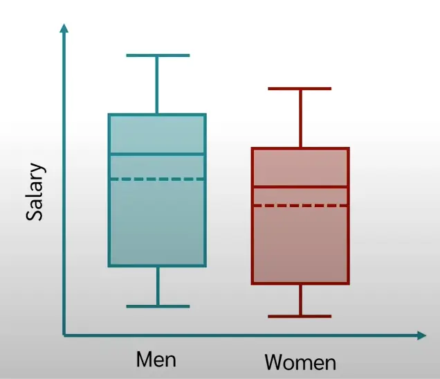 We are comparing the salary of men and women
The colored rectangle indicates the Interquartile Range, hence the lower part is the first quartile, while the upper part is the third quartile. The solid line is the median, while the dashed line is the mean. The whiskers, which are the T-shapes above and below, indicates the max and min values without considering the outliers.
statistics resources: